Ocado Case Study
Repositioning Ocado Group as a Global Tech Powerhouse
Despite being a global leader in automated logistics and fulfilment tech with a £2.2bn market cap, Ocado was still widely perceived as “just” another online grocer. We were brought in to change that.
Our task was to lead the creative strategy, branding, and digital execution for a new global-facing digital estate — one that would separate Ocado Group from Ocado Retail, and reposition it as a visionary, deeply technical partner to prospective international clients, investors, analysts, talent, and media.
ROLE
Art Director & Design Lead
The Challenge
The challenge was the absence of a cohesive brand identity across the group, which included multiple business units – Retail, Technology, Solutions, and Operations – each with its own ways of working, unique complexities, and stakeholder landscape.
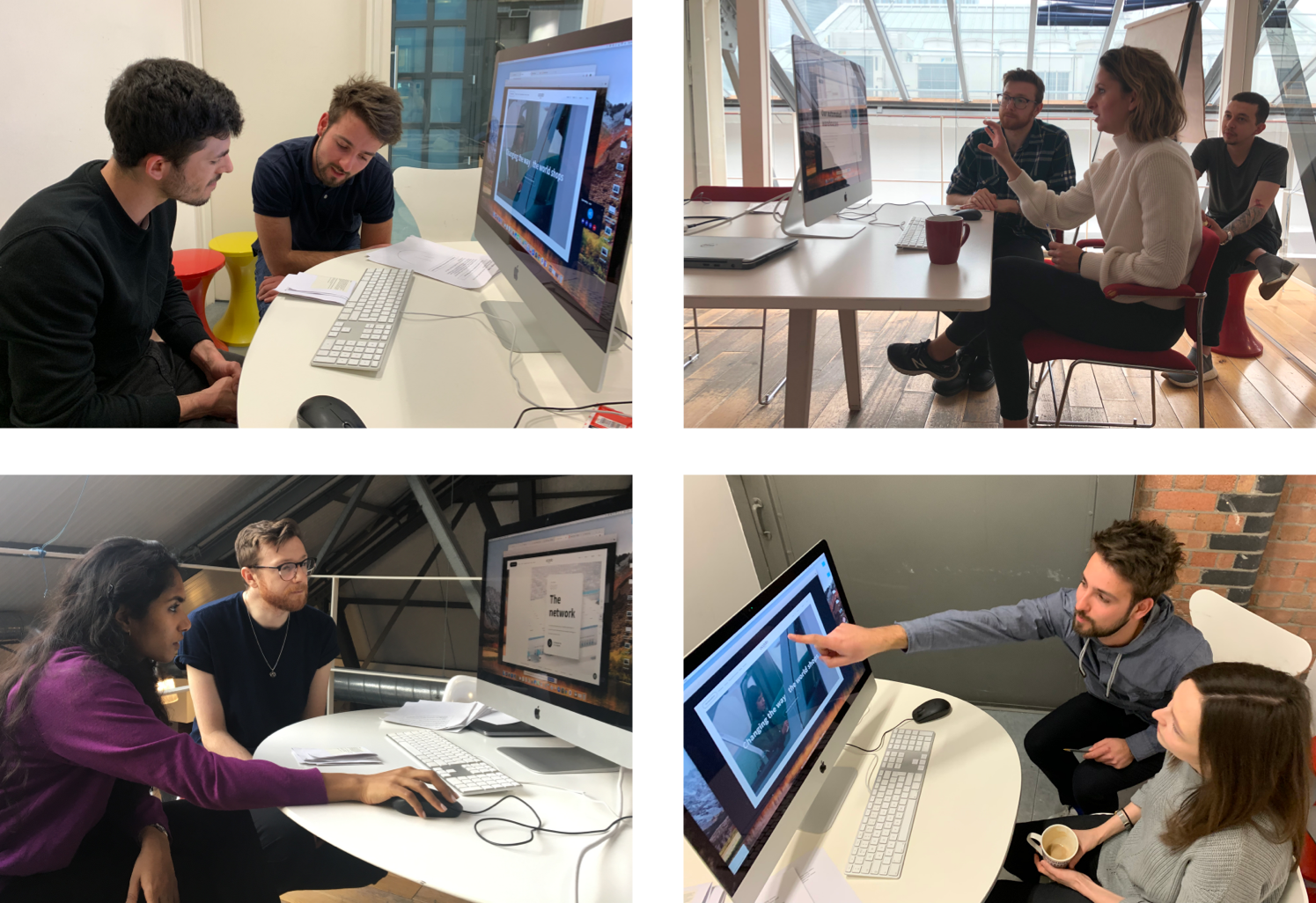
I led a multidisciplinary team of designers, strategists, content writers, as well as specialists in photography, animation, and illustration. We needed to:
- Align diverse internal stakeholders under a single brand story
- Build a digital estate that spoke credibly to B2B tech partners, not just shoppers
- Balance the needs of multiple audiences: clients, investors, talent, and media
- Reframe the company’s identity from “online grocer” to “global automation partner”
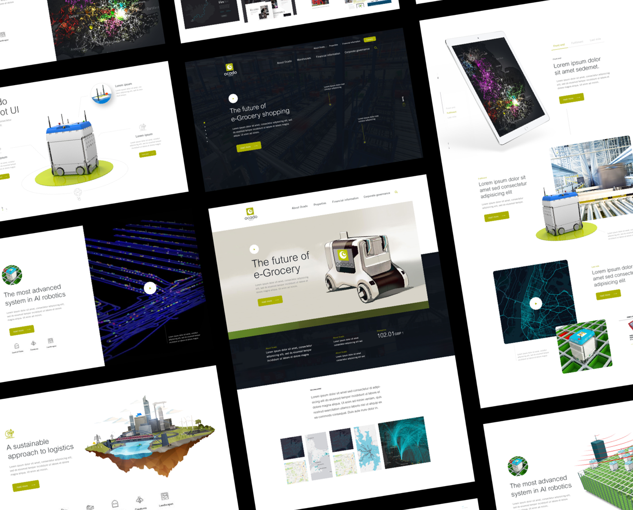
Winning Pitch Designs
The Pitch
We won the project with a bold, strategy-first pitch that challenged existing perceptions of the brand and offered a new creative direction grounded in Ocado’s true identity: "a deeply technical, visionary business solving the logistics of tomorrow".
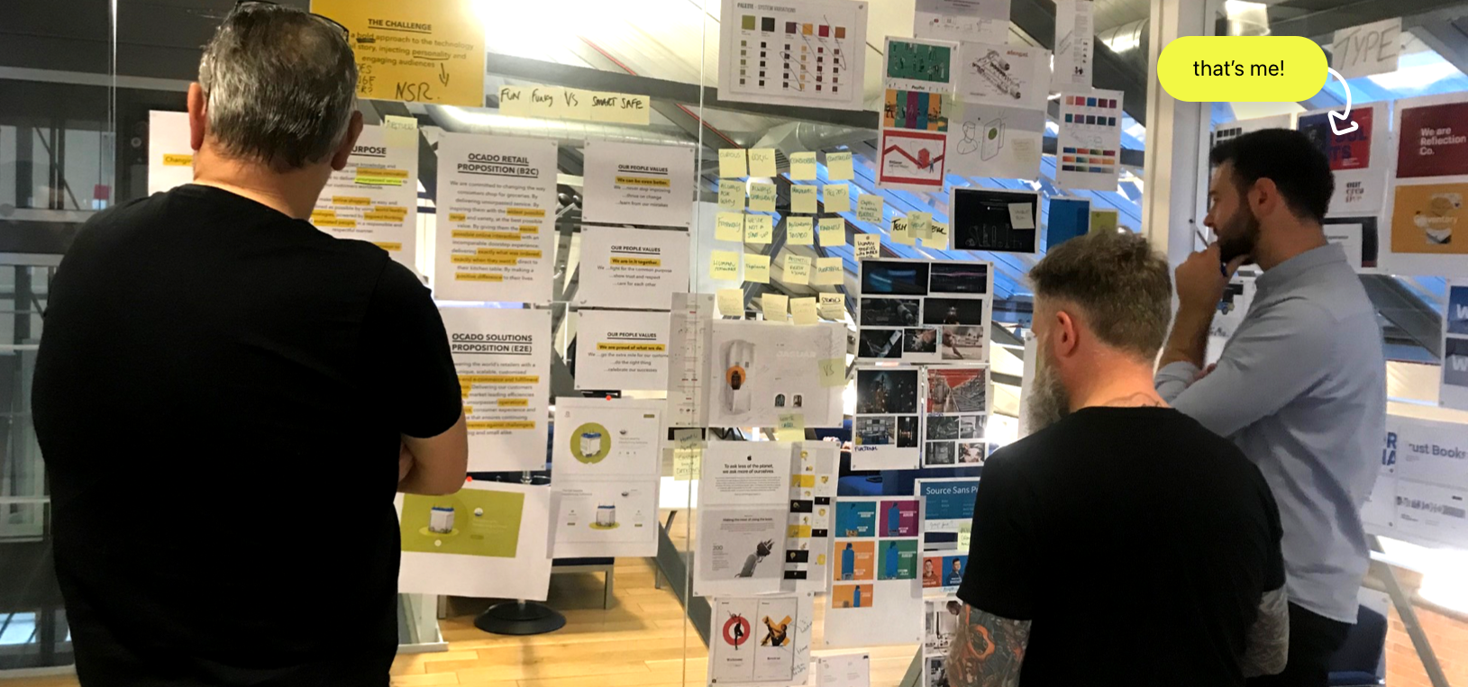
Research and Strategy
We kicked off the project with in-depth discovery sessions to shape both the strategy and creative direction.
- Conducted vision, brand, and strategy workshops with senior stakeholders across the 4 business units to align on tone, values, audiences, and objectives.
- Ran 2 public perception surveys — revealing that 74% of people still associated Ocado with grocery only.
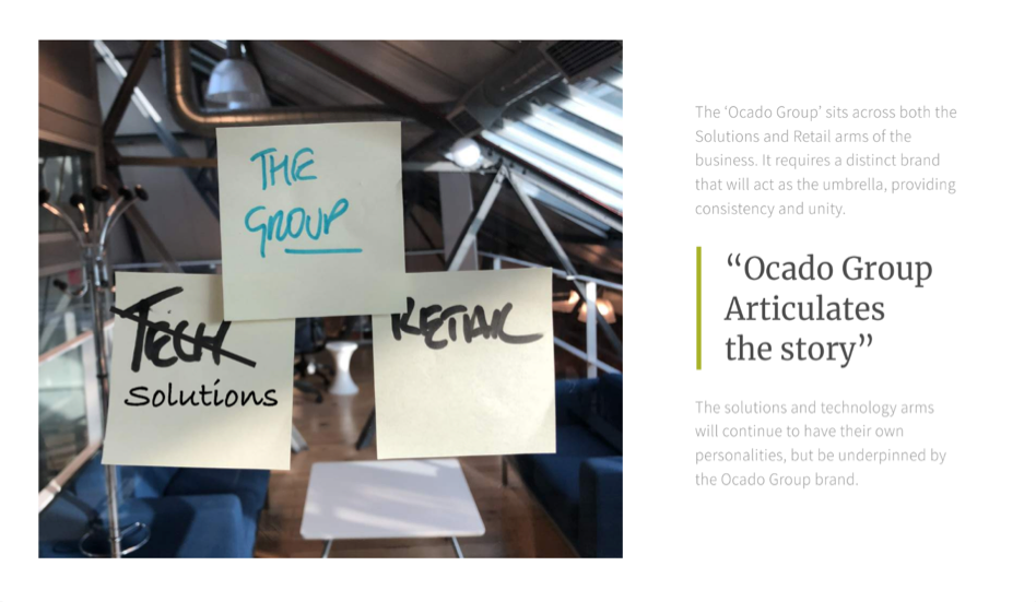
Unifying the Group brand
What does Ocado Group stand for?
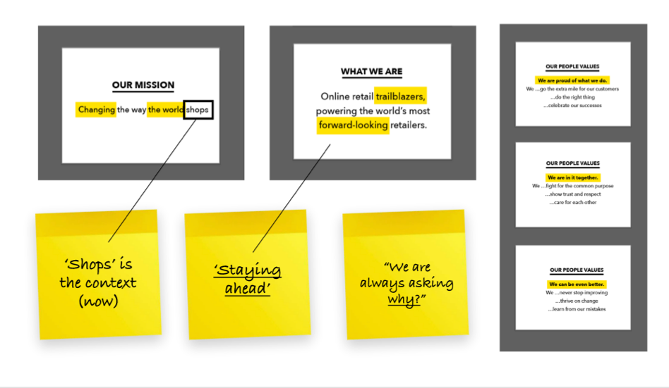
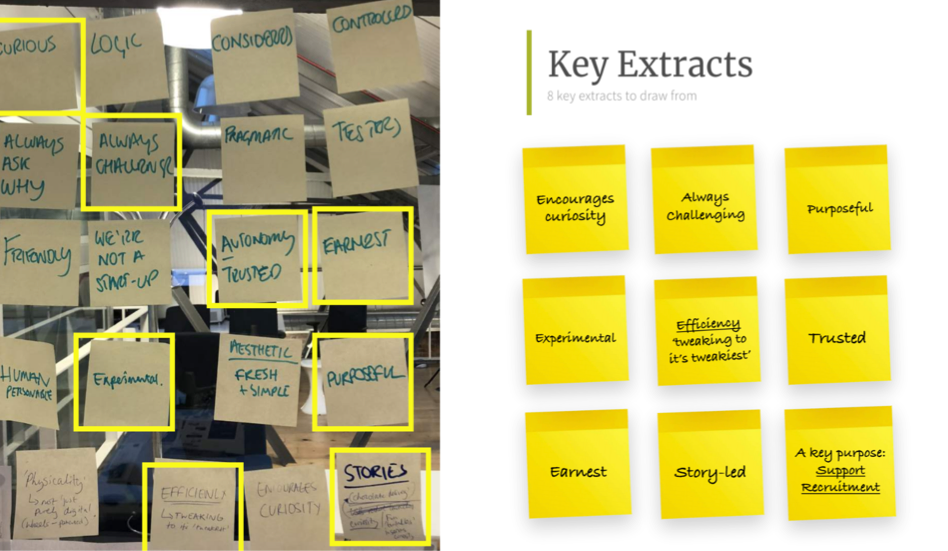
Mission, Vision, Values
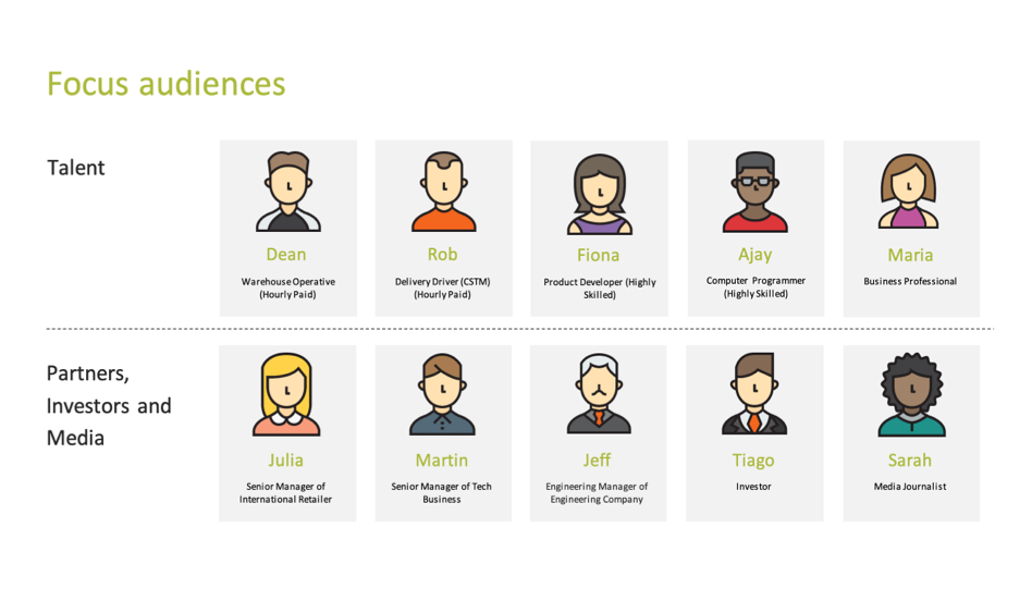
Personifying Focus Audiences
Developing a Visual Language
With clarity around our audiences and brand pillars, we began shaping a visual world that could express both technical mastery and human connection — without alienating future partners who might operate outside of grocery.
We explored two creative directions simultaneously:
- A white-label concept — hyper-futuristic, brand-agnostic, and modular, allowing global partners to imagine their own logos on warehouses, vans, and robotics.
- A human-centred photographic style — highlighting people across the fulfilment chain: engineers, technicians, and the end-users of the tech.
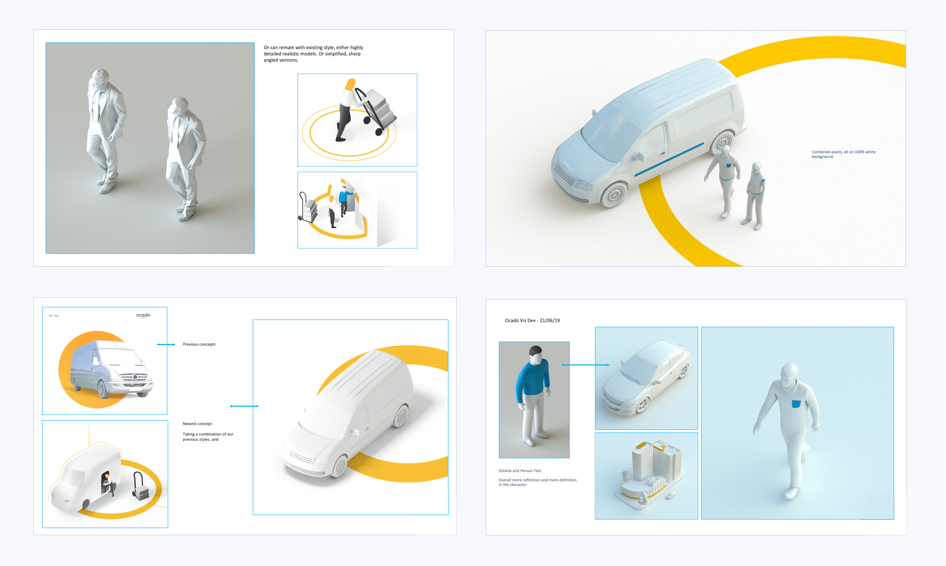
White-Label Development
To help potential partners see themselves in the Ocado ecosystem, we developed a futuristic 3D illustration style that stripped out brand cues.
- De-branded assets e.g. warehouses & vans
- Allowed partners to visualise their own identity on top of the tech
- Modular and adaptable across sectors
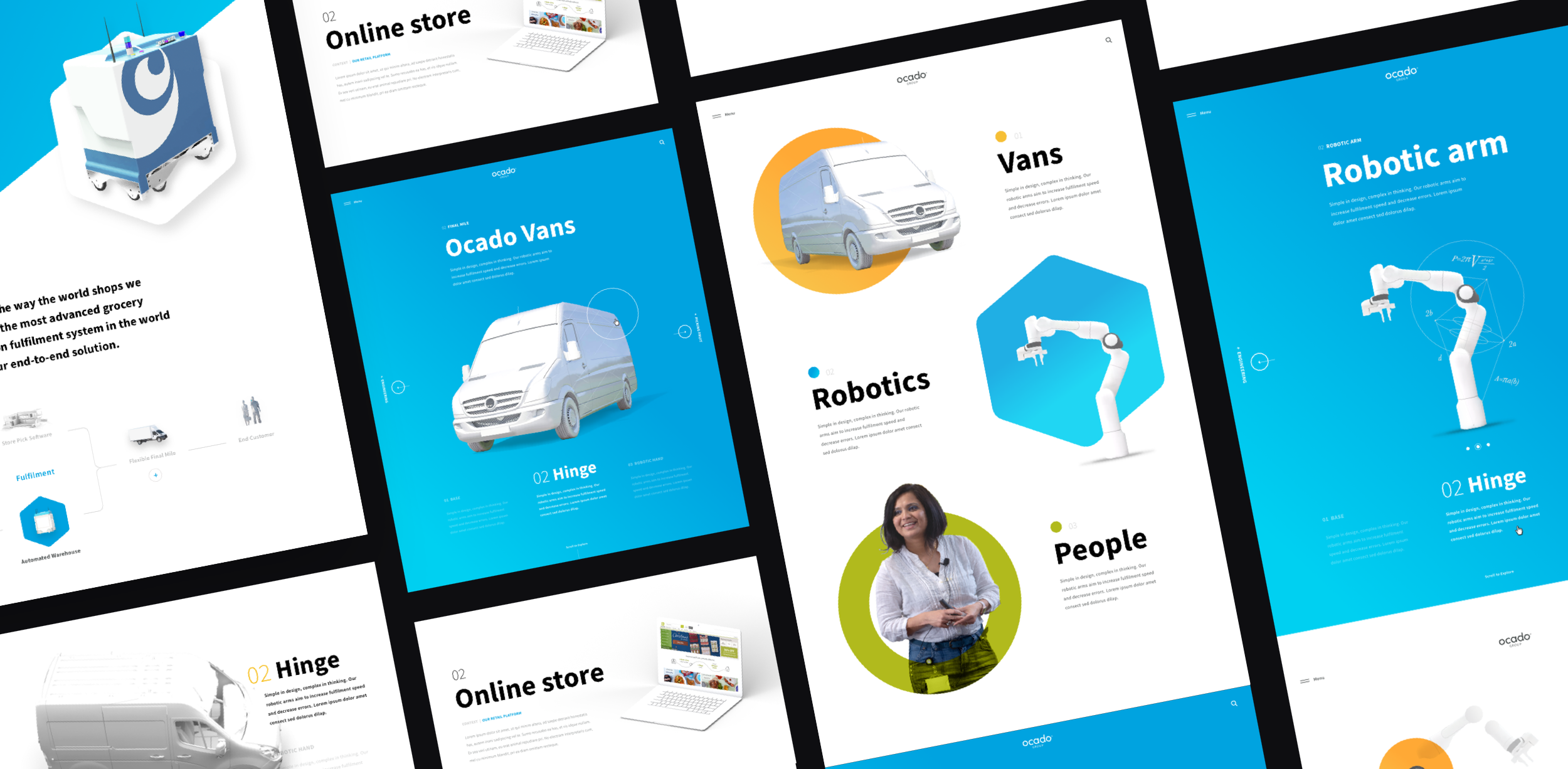
White-label Concept Development
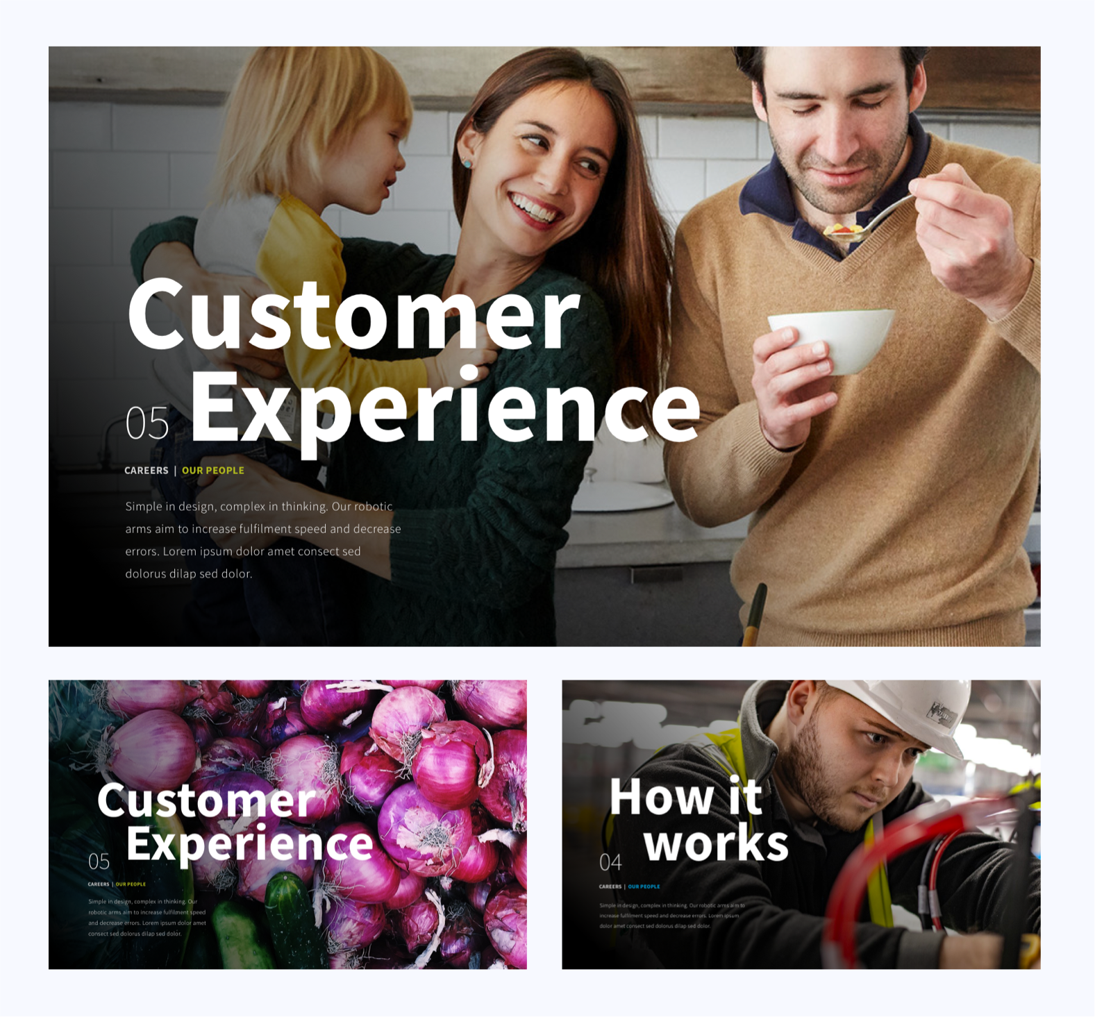
Photography for Connection
Alongside the white-label abstract visuals, we developed a warm, human photo style to ground the brand in real people and everyday impact.
- Photography designed to build emotional connection and relatability
- Showcased engineers, packers, and staff
- Included broader lifestyle imagery: food, stores, families
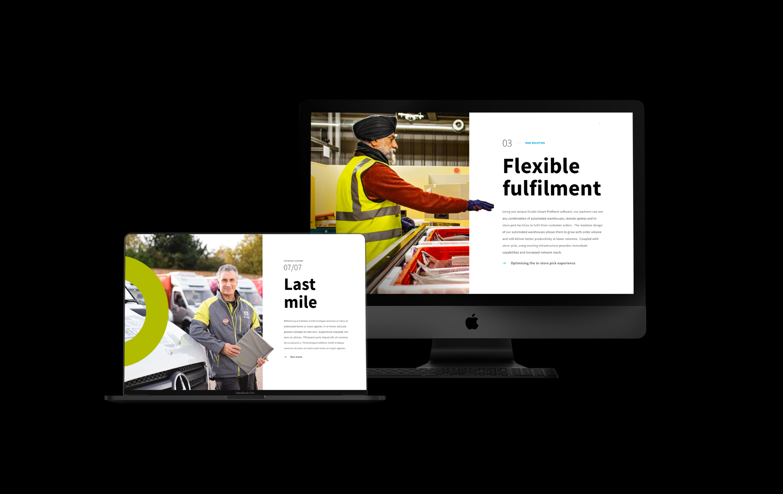
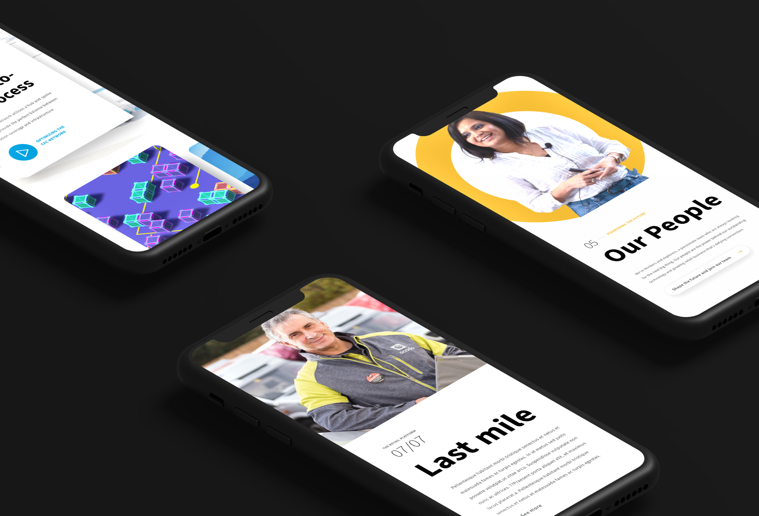
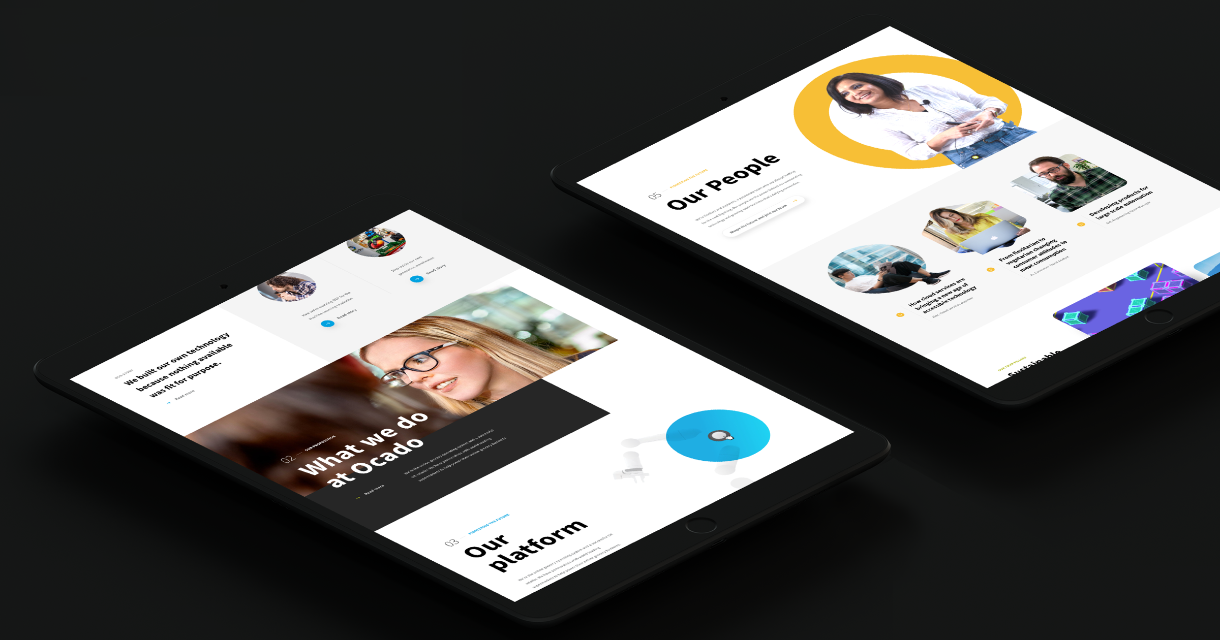
Final Creative Direction
Client feedback led us to merge both directions — balancing future-facing tech with human, operational storytelling. This hybrid direction became the foundation for our UX concepting and user testing.
- Photography now focused on Ocado Solutions and Operations teams
- Less consumer, more B2B — without losing warmth
- Illustration remained modular and de-branded for partner flexibility
- A unified visual system to support multiple sectors beyond grocery
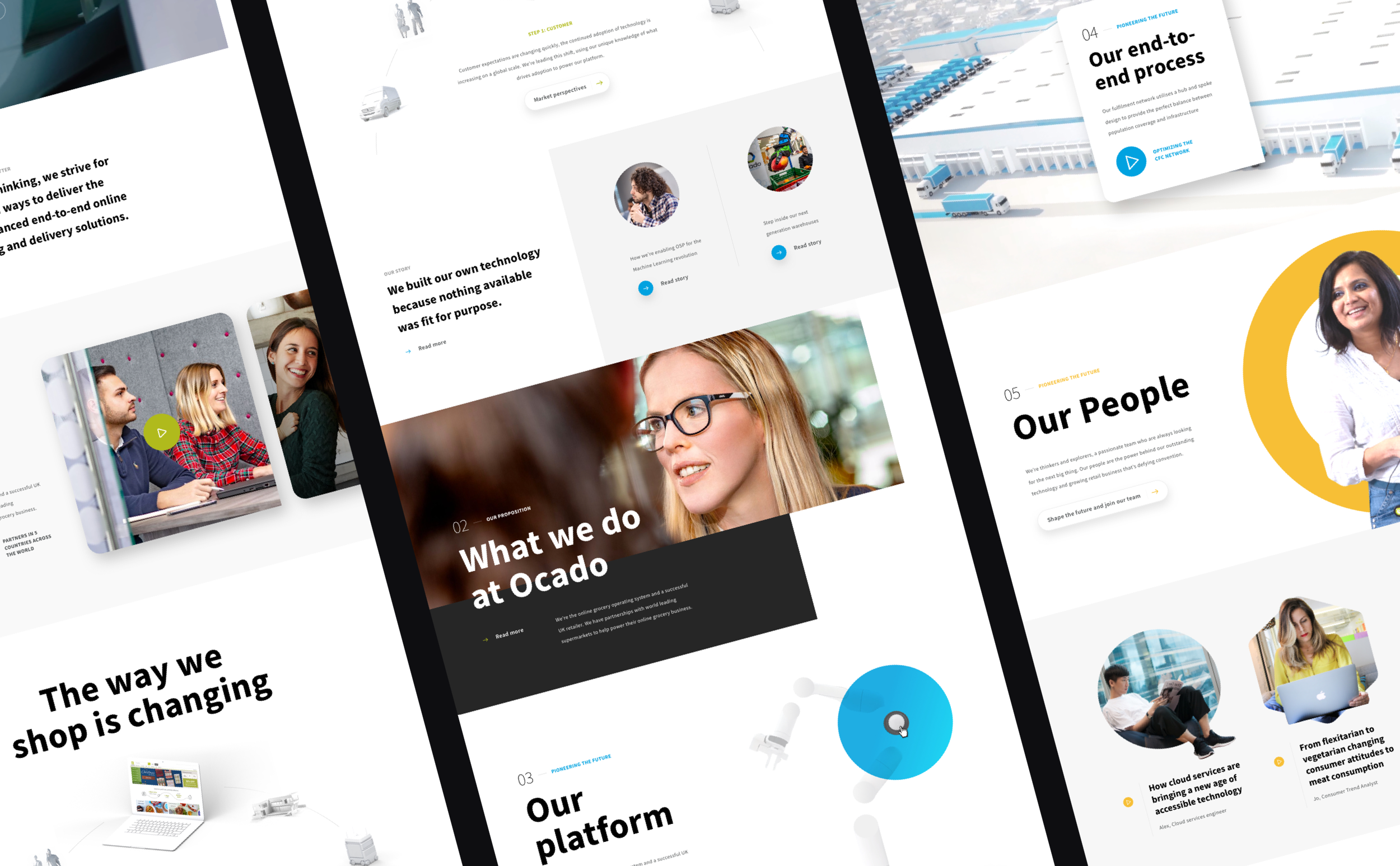
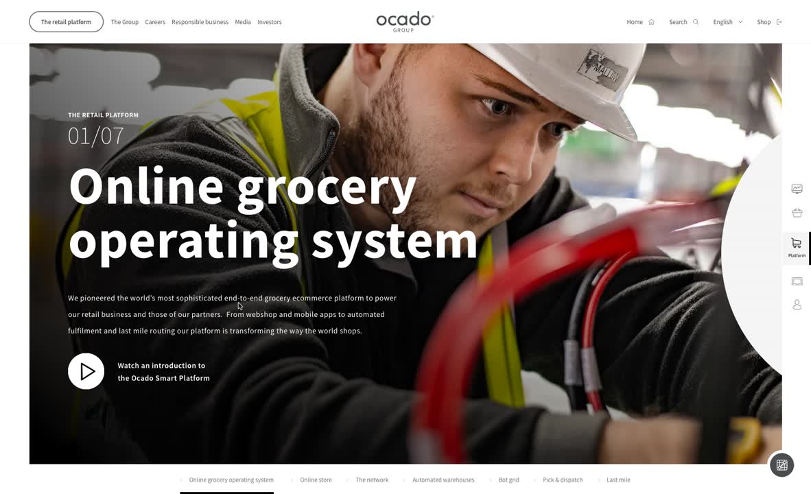
UX Concepting & User Testing
With the creative direction in place, we prototyped and tested two distinct UX concepts with 20 users across key audience groups. Given the complexity of Ocado’s offering (and therefore site-map structure), navigation was a major focus:
We tested a more conventional navigation, vs. a more experimental and app-like experience inspired by Ocado’s warehouse grid system (see prototype below).
The winning solution
While the experimental navigation above was bold and visually striking (it also landed well with the client), the grid concept proved too complex and disorienting for real users.
The clearer, content-led approach tested better for speed, clarity, and usability.
Design System & Digital Rollout
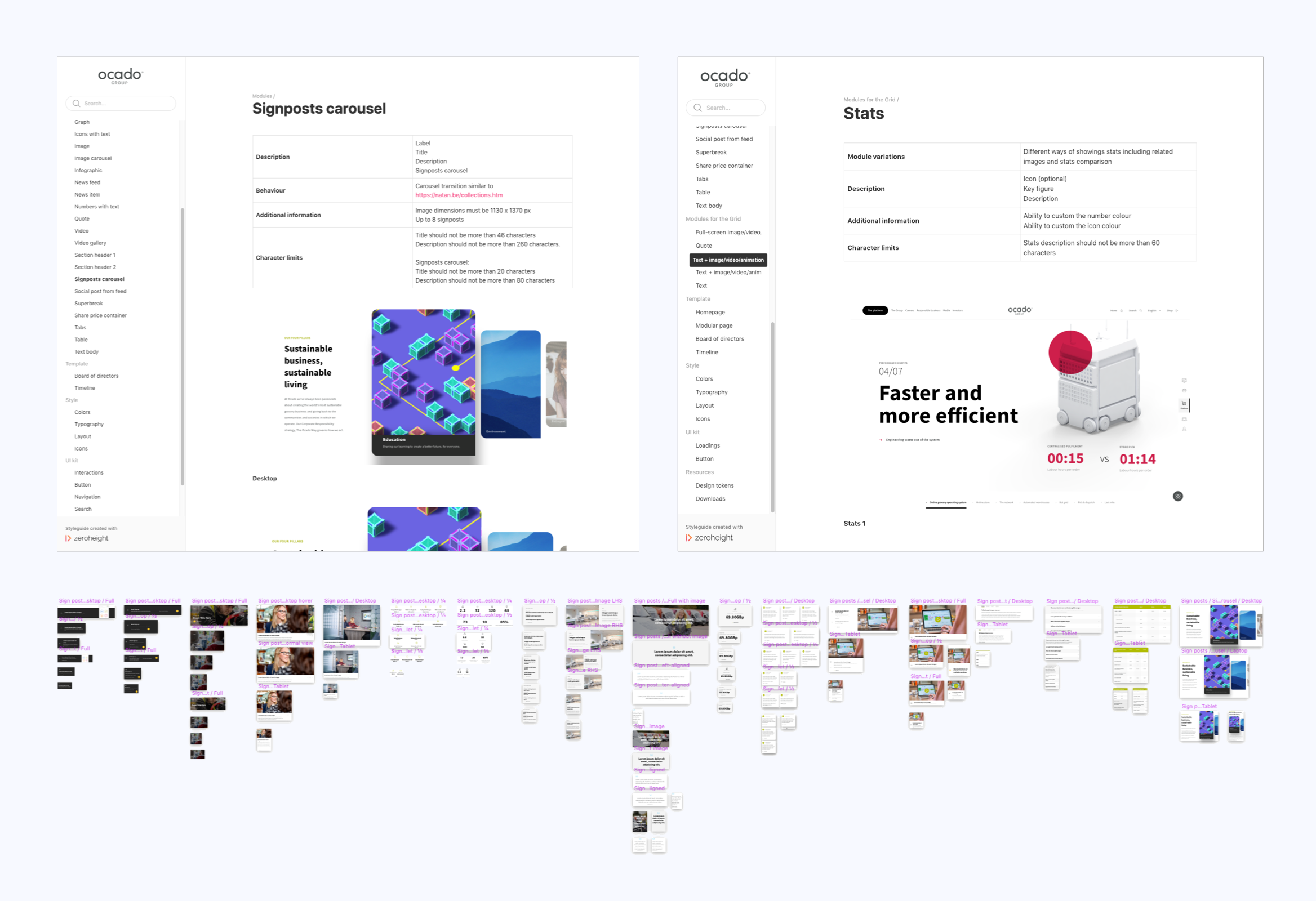
We built a modular design system from the ground up — flexible, future-proof, and ready to scale.
- Created a full UI kit: type, iconography, components, interactions
- Documented in ZeroHeight for easy dev handover
- Integrated with a headless CMS for flexible, content-led pages
Impact
The process aligned internal stakeholders under a unified global strategy — with the site cited in Ocado’s Annual Report as 'a key signal of brand maturity and momentum'.
- 29% uplift in inbound commercial enquiries (client-reported)
- +104% increase in session time across group websites
- 34% increase in job applications via new careers portal
The brand and digital estate was nominated for several awards in B2B and corporate communications categories, including ‘Best Brand Initiative (budget £100,000 and above), and ‘Best Enterprise Targeted Campaign’ at the B2B Marketing Awards.
Failures & Learnings
Some of our boldest bets didn’t pay off. But every misstep made the outcome stronger — and taught us lessons we’ve taken into future enterprise engagements.
Don’t pitch the impossible.
The Grid-based UX concept was a hit in theory but a miss in practice — high cost, low usability. We learned to gut-check technical viability before building excitement.
Unify stakeholders early.
Initially, we tried to please every business unit in isolation — leading to fragmented feedback and scope creep. We later brought all key decision-makers together to align before deep execution.
Plan for bottlenecks.
Some parts of the org were fast-moving, others weren’t. Our waterfall plan broke down. Instead, we shifted to iterative launches by section, which reduced pressure and maintained momentum.
You can't test what you can’t access.
We couldn’t speak to Ocado’s external partners — so had to rely on internal proxies and external recruitment. In hindsight, we should’ve aligned earlier on what user research was actually feasible.