More Than Case Study
I joined RSA Group (parent of More Than) as a UX Architect and Designer on their brand-new internal digital team. Until then, RSA had relied heavily on external agencies — but with growing pressure from insurance comparison sites, they brought digital in-house to better own the customer journey.
While this is one of my earliest case studies, I’ve included it because the lessons I learned at RSA remain hugely relevant — offering practical anecdotes I still use to educate stakeholders on the value of design, UX, and data, and continue to shape the way I approach problem-solving today.
Company
More Than
ROLE
UX Architect & Digital Designer
TEAM
In-house
Duration
2012 - 2014
The Challenge
My journey at RSA began within the More Than product's digital agile team. The car insurance product was underperforming. Conversion targets weren’t being hit, and the product manager raised it with senior stakeholders. My job was to find out why — and how to fix it. Google Analytics showed a 38.83% drop-off after users entered their details (up to 60 user inputs) — but before they ever saw a quote.
That didn’t make sense. Why would users do all the hard work, then leave before seeing the result?
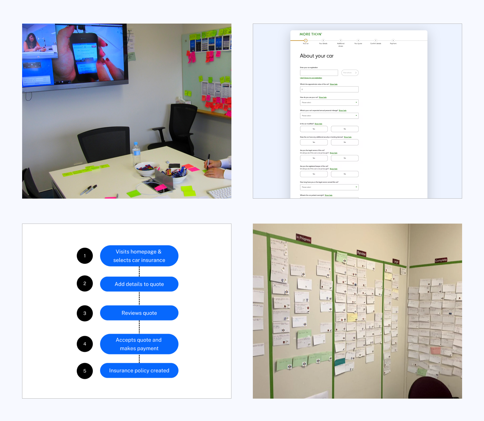
Discovery & Insights
We ran 16 remote user tests and found:
- 72% of participants encountered a blank loading screen for at least 18 seconds
- Some quotes took up to 43 seconds to return
- The average user waited just 24 seconds before giving up.
- Frustration + Ambiguity = Abandonment.
The tech was working — just slowly. With no feedback or reassurance (just a spinning wheel), the users assumed the site had crashed. They left.
Ideation & Testing
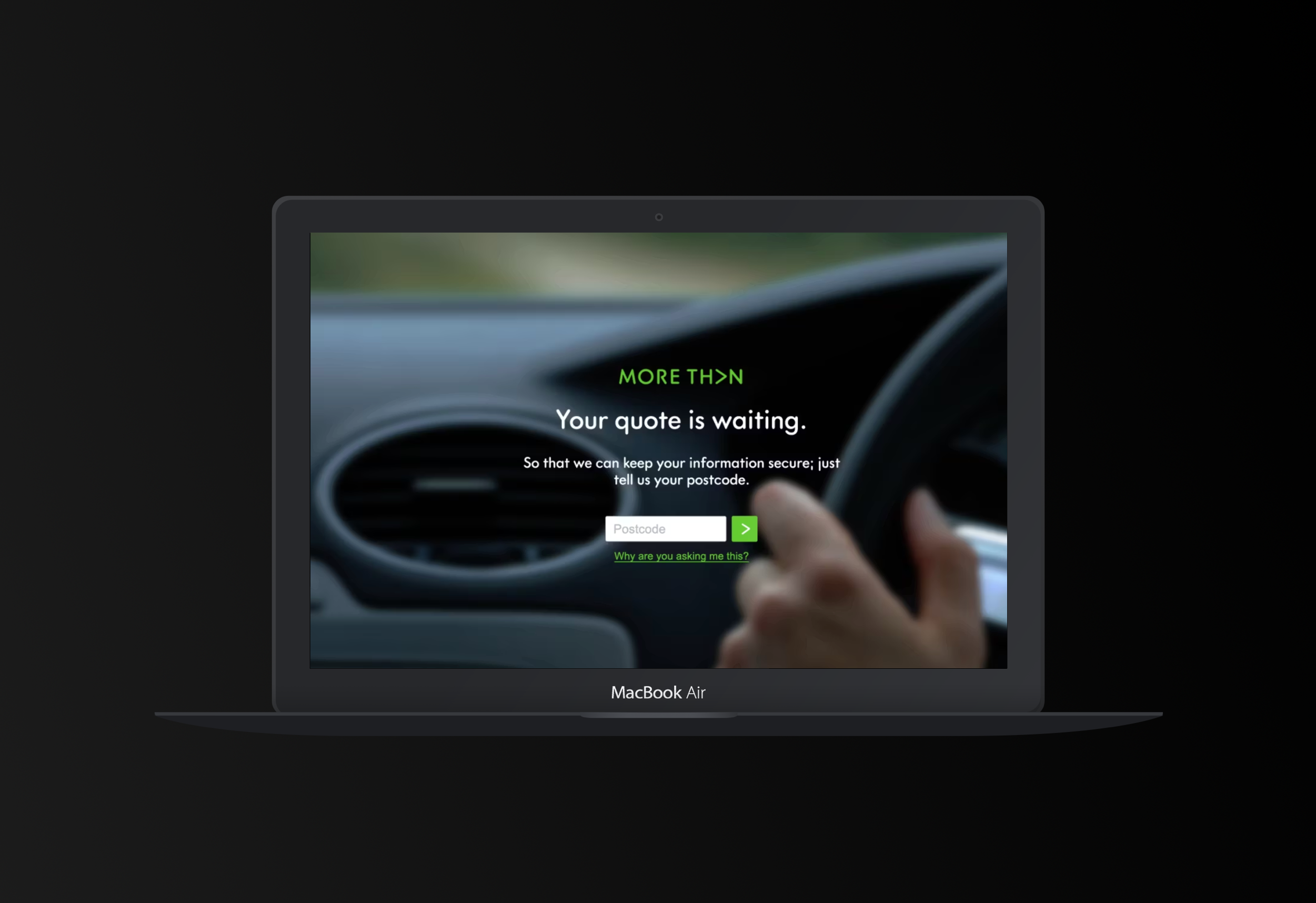
Working with engineers and data science, we ran 3 low-cost multivariate tests. Our goal: Buy time + build trust while the system generated the quote. The winning solution:
- A fast-loading “progress” screen (under 0.25s)
- Strong imagery to subtly 'place the user in the driver’s seat'
- A trust-building micro-interaction which also kept the user engaged: “Your quote is waiting. So that we can keep your information secure; just tell us your postcode.”