Dualo Case Study

Building and Launching a SaaS Tool for UX & Insight Teams

Despite the explosion of design and research tooling, most product teams still rely on messy docs, static decks, and forgotten wiki pages to organise and share the insights they're discovering.

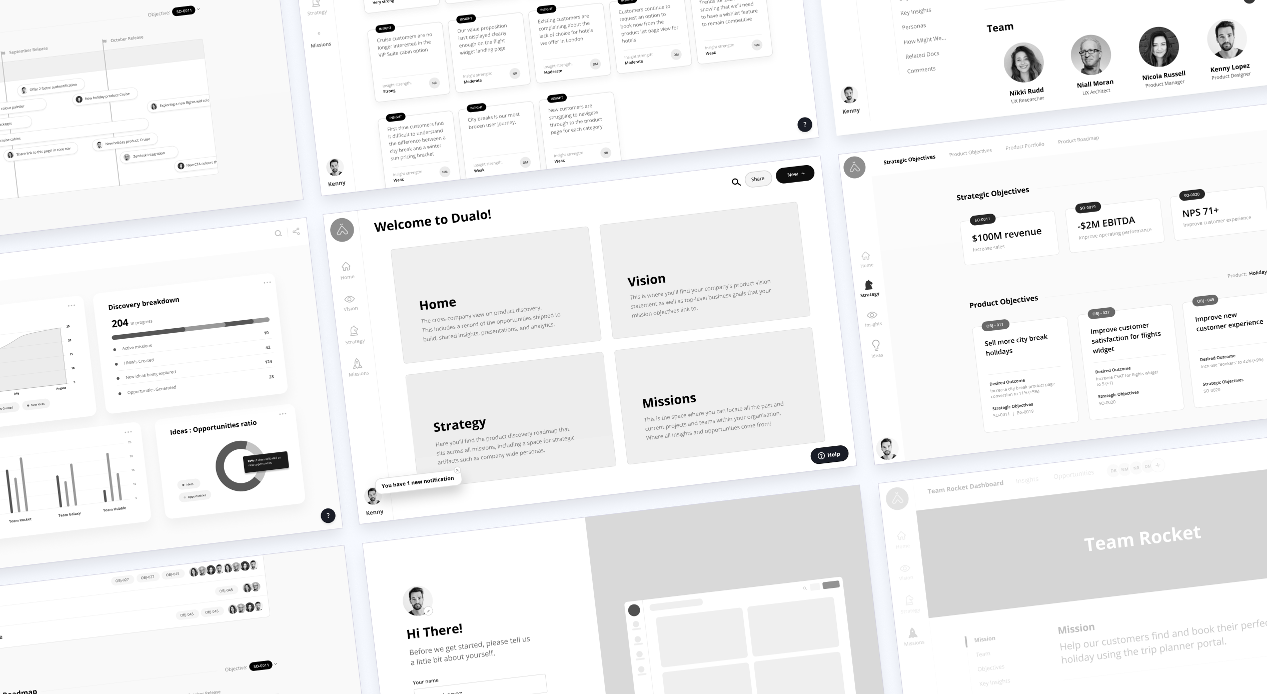
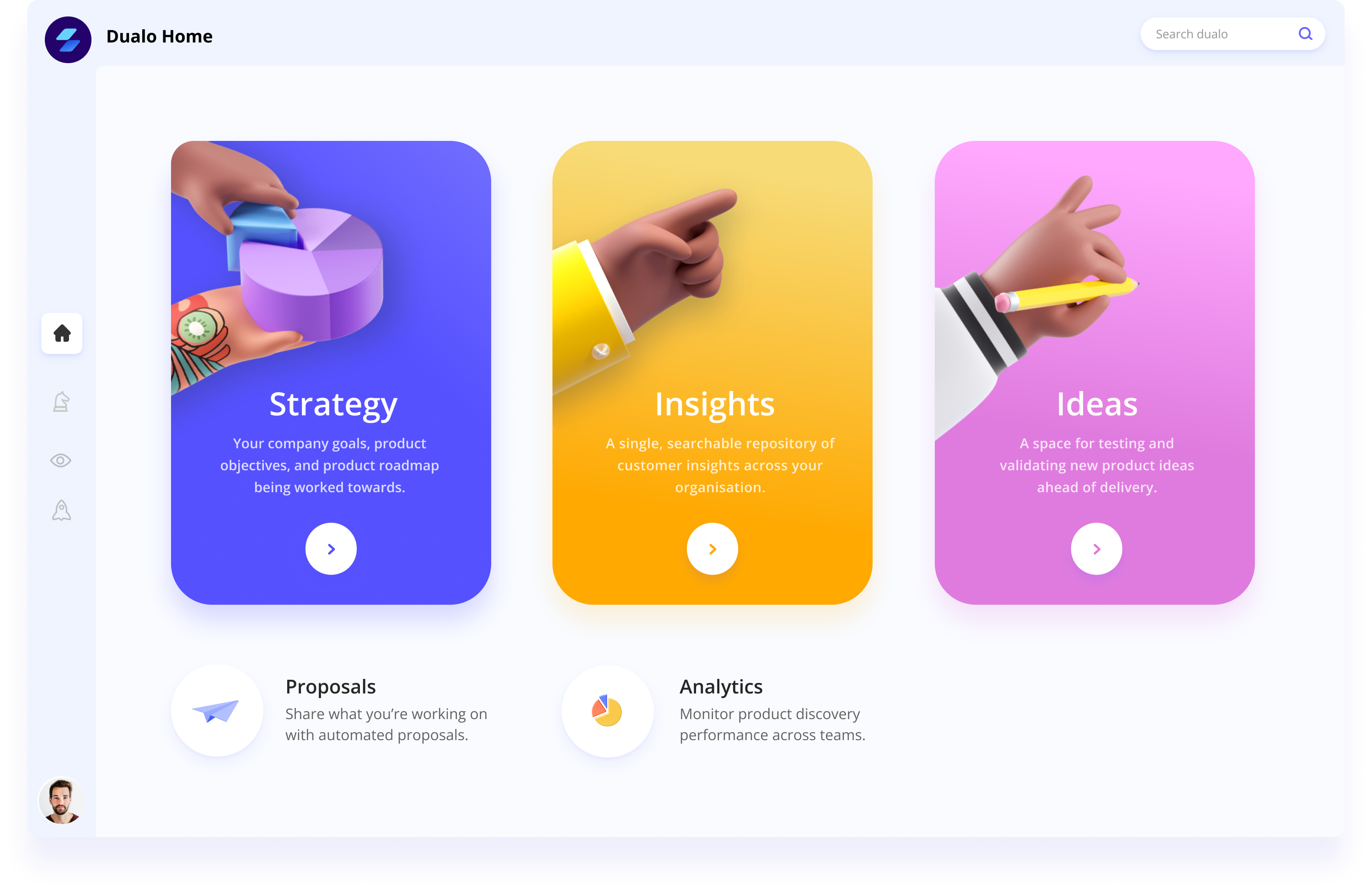
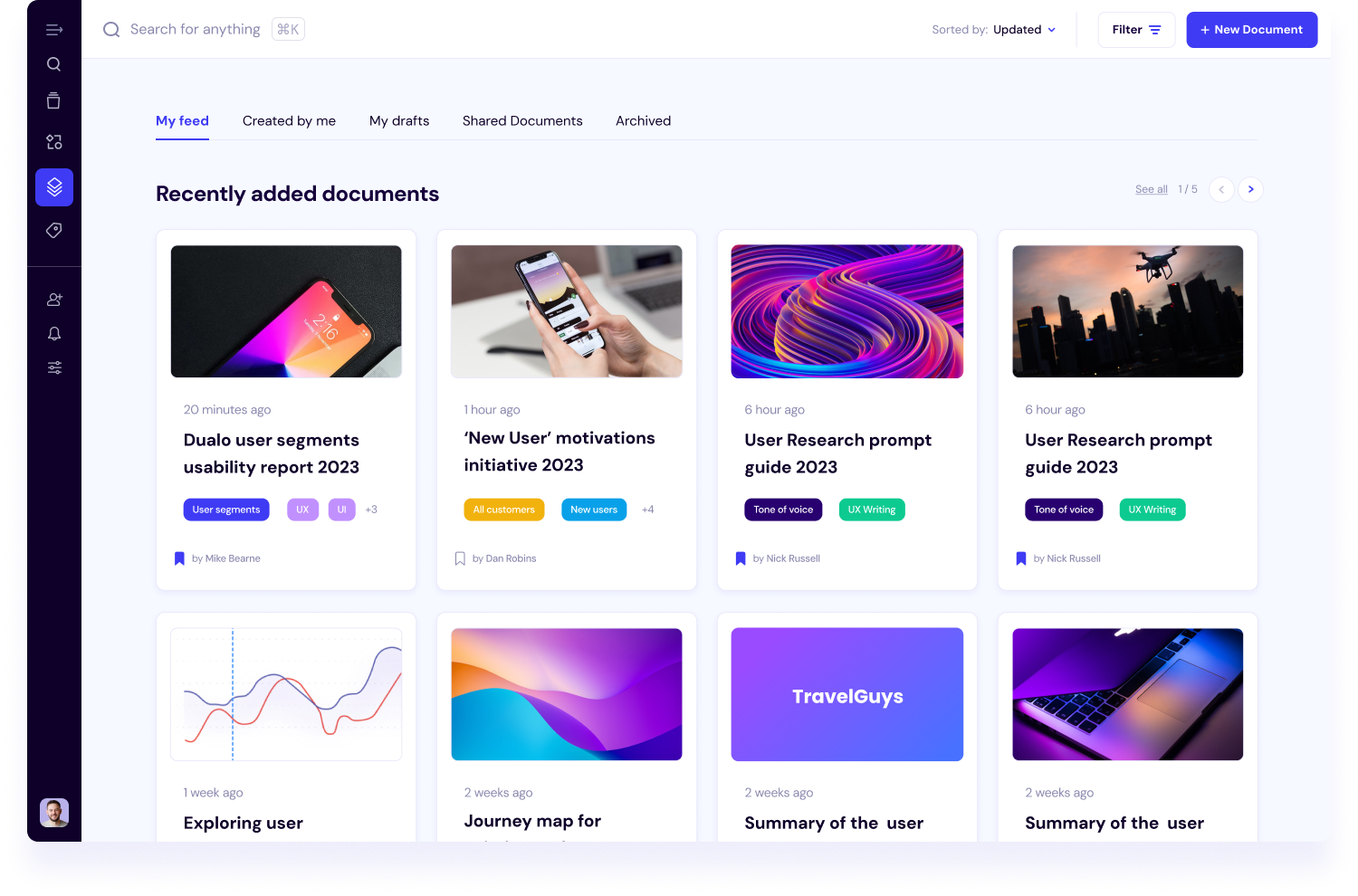
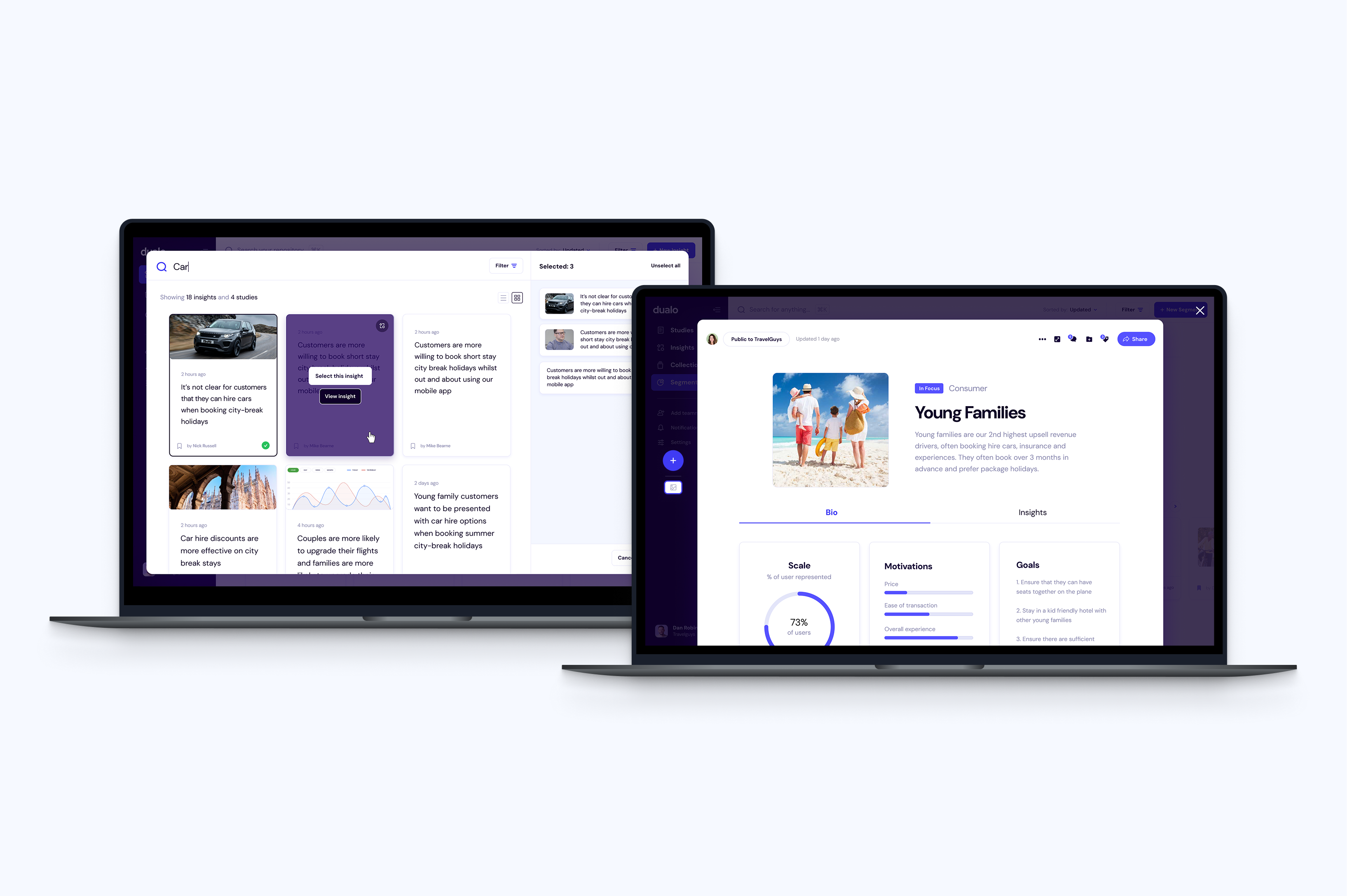
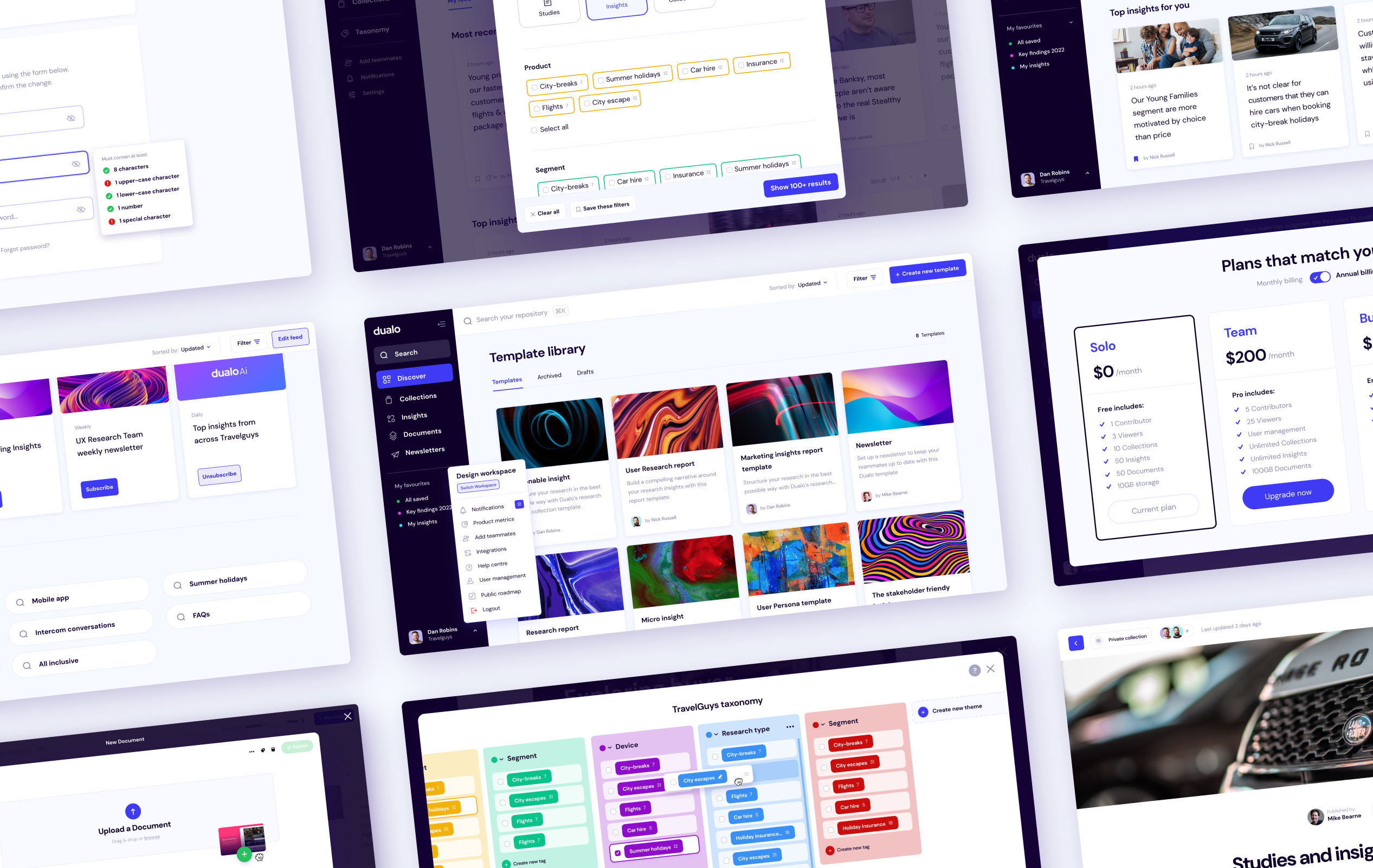
In 2020, I co-founded Dualo — a B2B platform designed to help UX, Design, Research, and Product teams break down silos and turn insights into action.

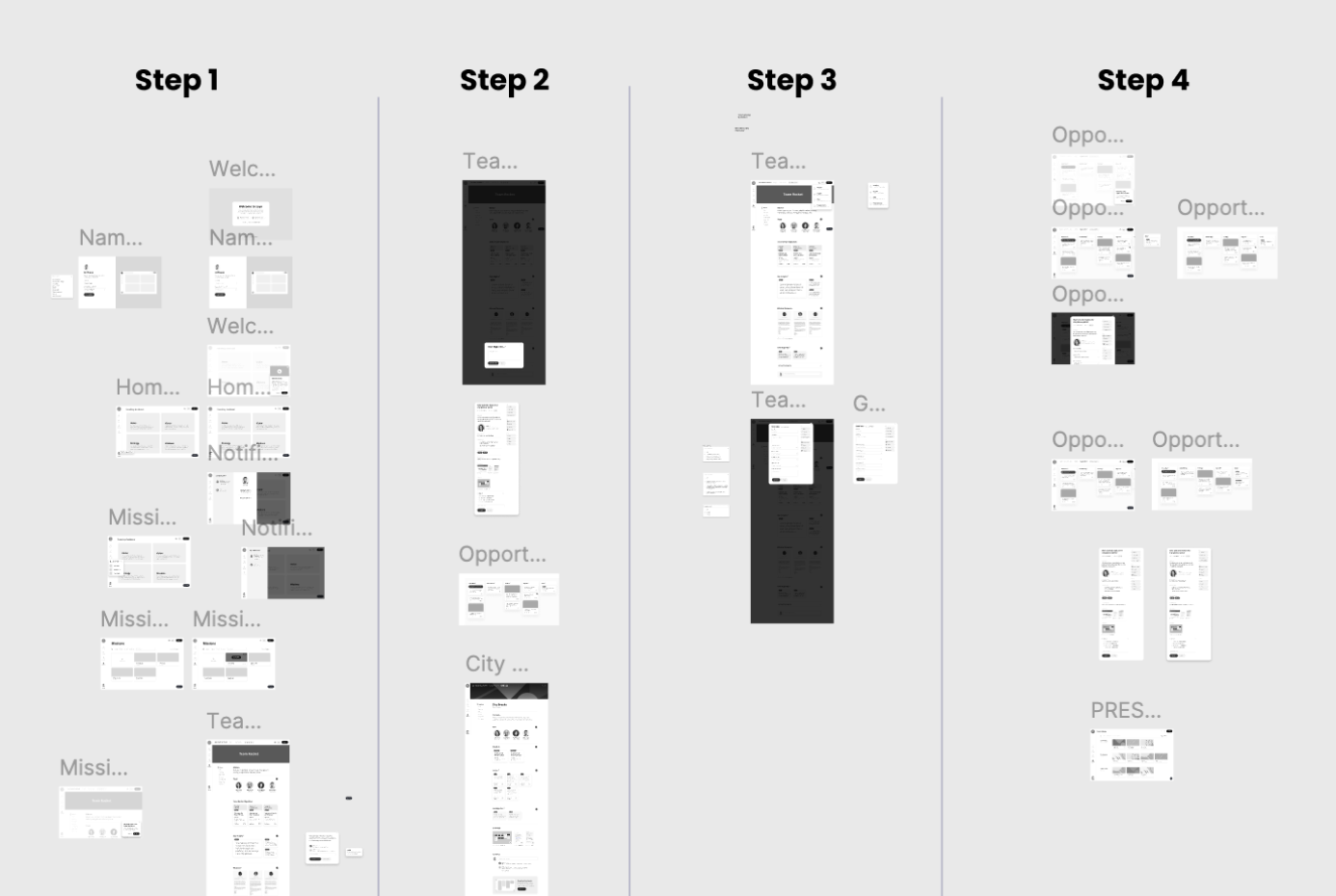
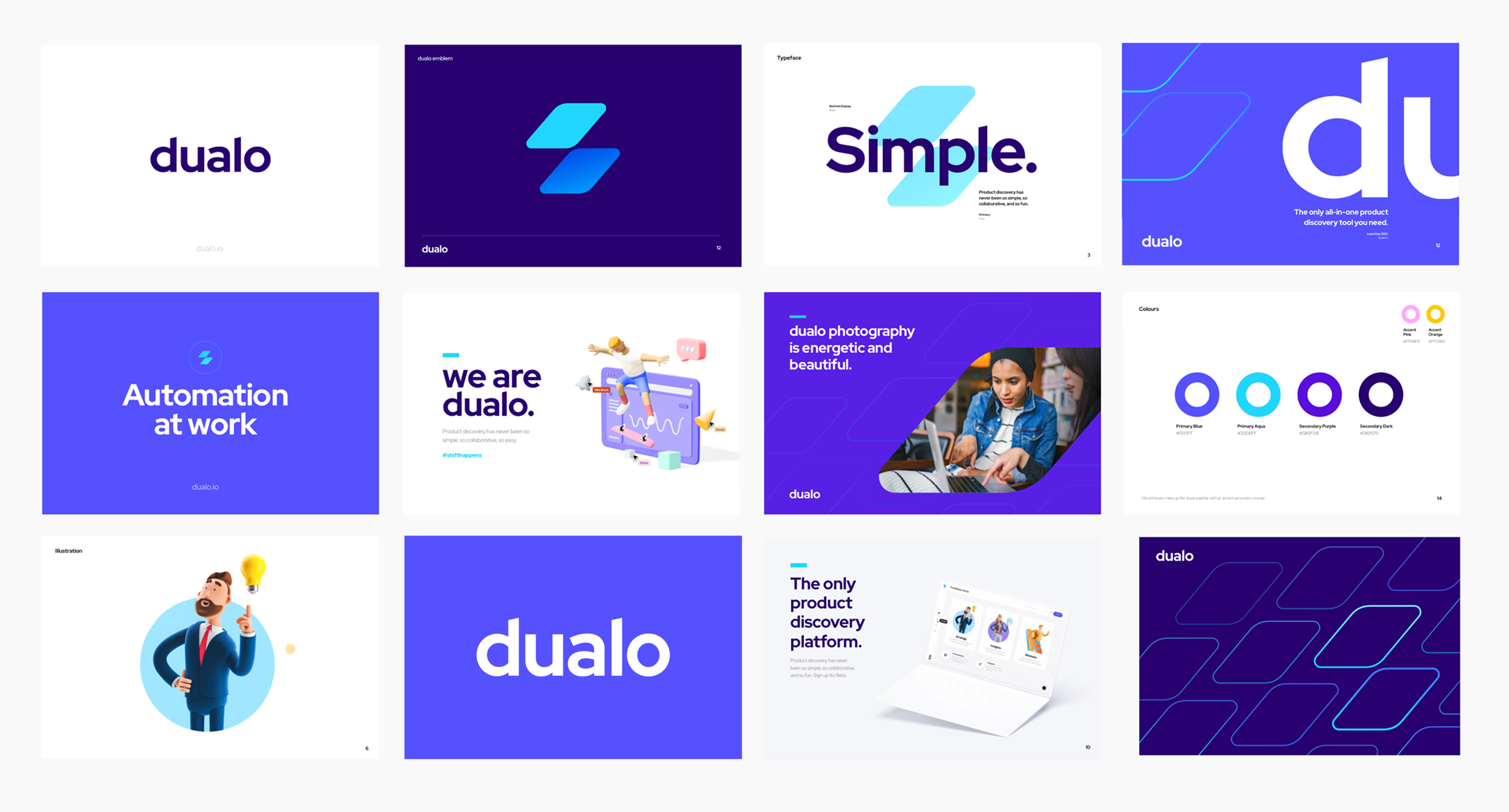
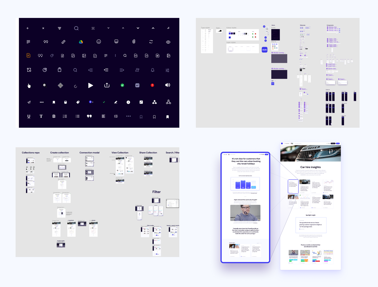
As Creative Director, I led the product’s go-to-market design and strategy: from research and branding, to prototyping, testing, launch and beyond.

Company
Dualo
ROLE
Creative Director
TEAM
Dualo Founding Team
YEAR
2021 - Present

The Challenge

We’d raised £140k in angel investment pre-product, pre-revenue. The challenge was to design, validate and launch an MVP solution that solved a real problem — and that customers would pay for.

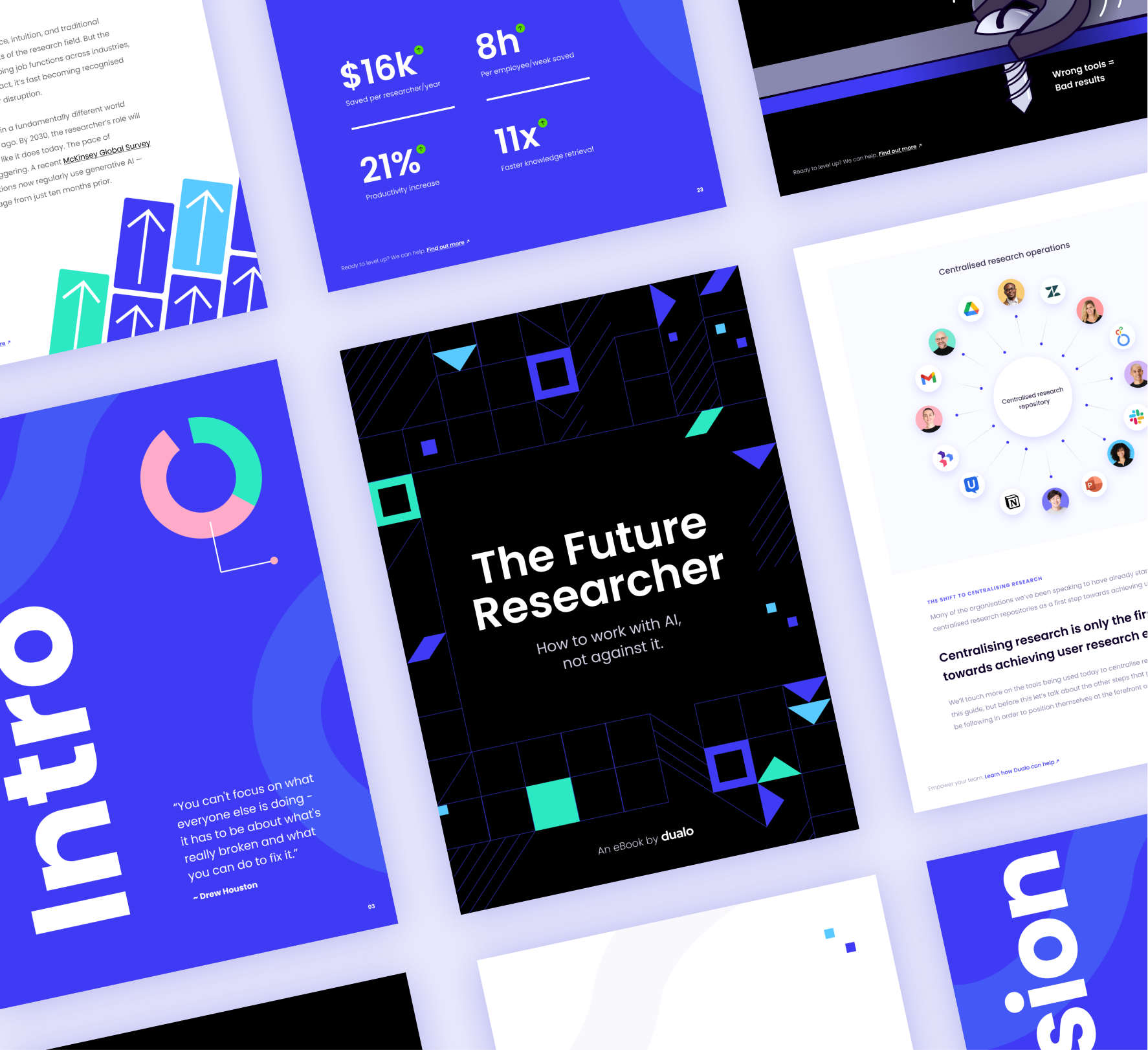
We set out to understand and address a growing frustration: product teams were drowning in knowledge, yet couldn’t access it when it mattered. Our mission was to build a tool that solved the right problems around insight discovery, without overwhelming teams with yet another platform.

Understanding the Insight Bottleneck

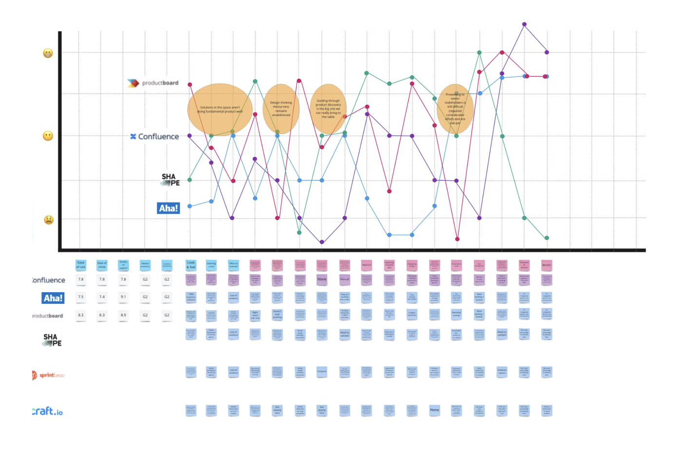
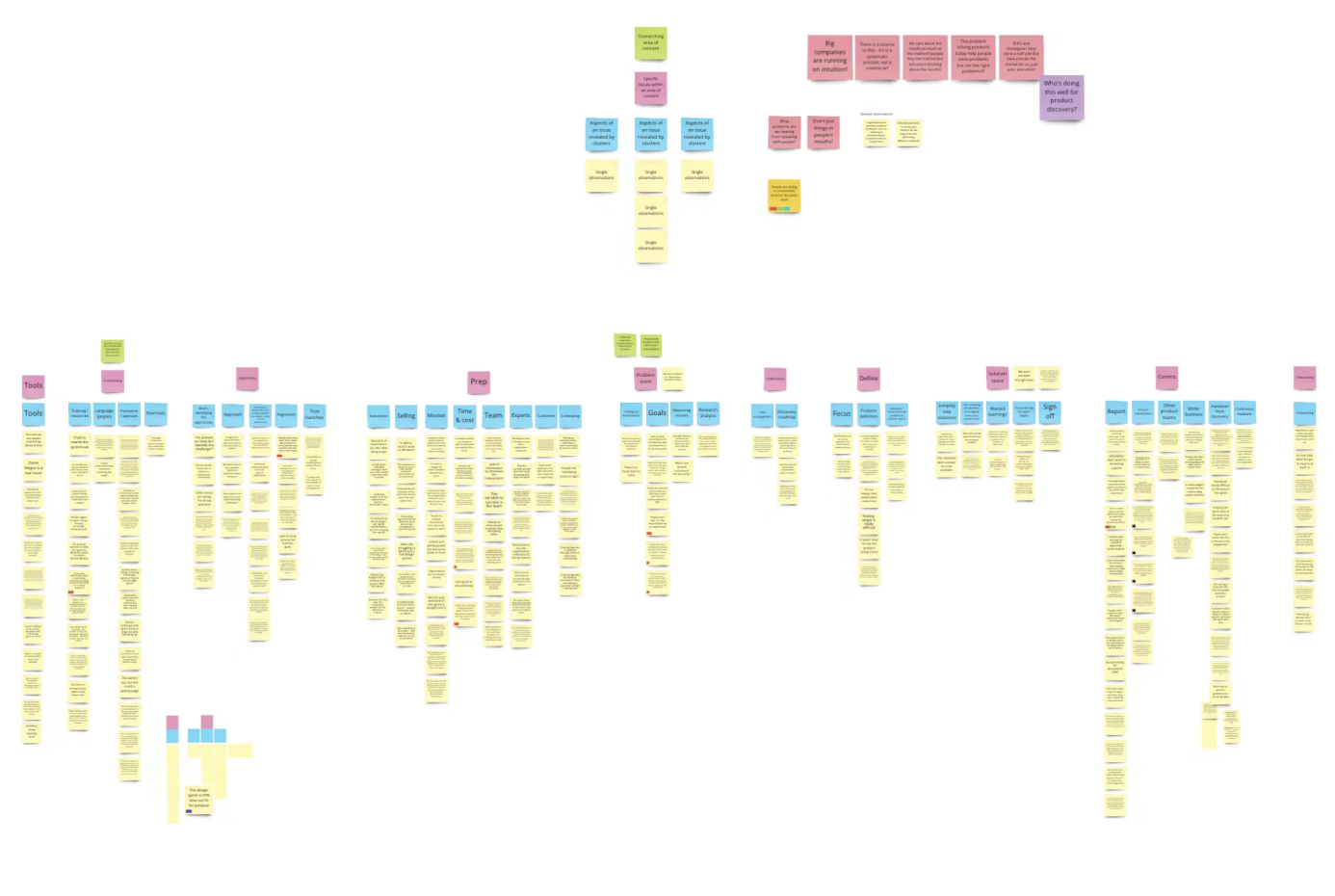
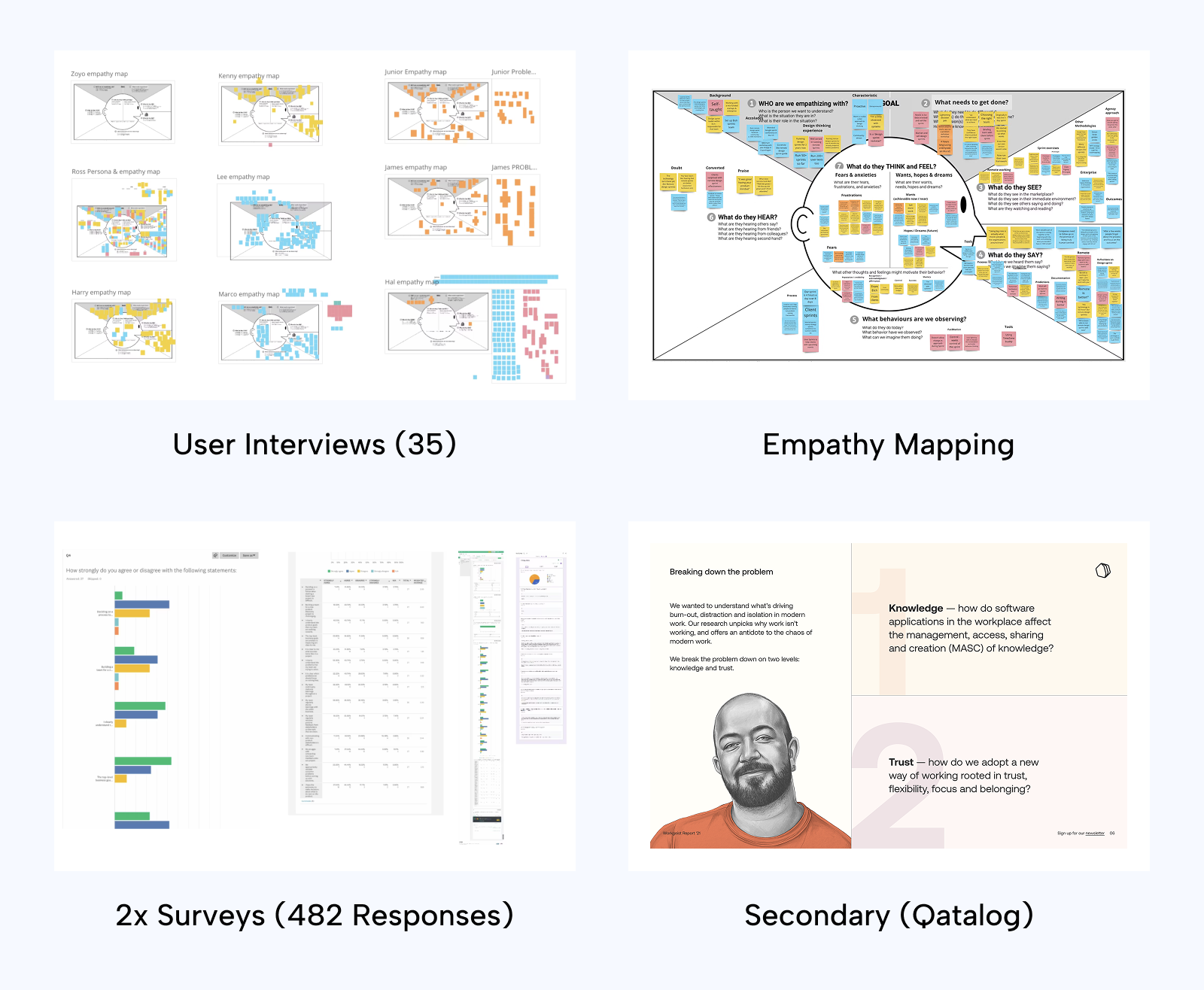
We began with 35 in-depth interviews across our target audience — UX Researchers, Product Managers, Designers, Data Scientists, and Product Stakeholders. Using empathy mapping, we identified key pain points across workflows, tooling, and team collaboration.

We triangulated this with primary quant data from two surveys (482 responses), and mixed method secondary research from Qatalog and Cornell University.

Key Insights from Discovery

We focused on 4 key insights discovered during our research:

  • 75% of respondents said they worked in silos, with “little to no” visibility beyond their immediate project.
  • The average product team has “100+” UX reports, yet less than 18% of stakeholders knew how to find or access them when needed.
  • 49% of teams conducting research worried that their insights would never reach the intended audience.
  • Teams were losing ~59 mins/day searching for insights and past project information buried in decks, docs, and Slack threads.
Problem Statement
Product teams are overwhelmed by inaccessible knowledge. Insights exist — but aren’t discoverable, shareable, or actionable when they’re needed most.

Ideation & Testing

After synthesising our insights, we conducted a detailed competitor gap analysis to inform ideation. Using affinity mapping, we identified the highest-impact concepts and developed user flows, which we translated into interactive prototypes for three potential solutions — tested across 24 moderated and unmoderated sessions.

We evaluated concepts using usability scores, desirability testing, and stakeholder interviews — landing on a single winning direction that would shape our MVP.

Competitor Benchmark Review (Miro)
Ideation & affinity mapping (Miro)
MVP User Flows (Miro)
MVP Prototype Testing (Figma)

Branding & Creative Direction

With the MVP defined, I led the development of Dualo’s brand — starting from scratch.
We wanted the brand to feel modern, dynamic, and intelligent — inspired by the idea of “dual-track” discovery and the movement of ideas through organisations.

  • Colour palette designed for vibrancy + credibility
  • Illustrations, motion graphics and animations to bring features to life
  • We explored a logo and emblem inspired by connection, movement, and abstraction
  • Tone of voice grounded in clarity, optimism, and confidence

UI Development

Once the brand direction was set, we tested two UI concepts: ‘Playful Modern’ and ‘Enterprise Sleek’. The winning solution was ‘Enterprise Sleek’ as it felt intuitive, familiar, and — crucially — more trustworthy, which was key for an enterprise audience.

'Playful Modern' Concept
'Enterprise Sleek' Concept

Product Design

Using this, I built the full MVP design system in Figma:

  • UI components, iconography, interaction specs
  • Help Centre and onboarding flows
  • Accessibility and responsive behaviour baked into every component
Developing the Design System (Figma)

We built the MVP design system in Figma, including many fully bespoke UI components such as our 'multi-modals'.

Using Zeroheight, we collaborated with engineers to deliver dev-ready components with clear states and behaviours.

The system scaled from MVP to launch with minimal design debt.

Go-to-Market Execution

I led the creation of the marketing website, designed to convey trust and vision — and to convert. We also launched a thought leadership playbook as a lead magnet (1000+ downloads in 3 months), and a teaser video animation that drove over 500 early access signups.

Together, these creative assets helped us build an early waitlist of engaged, high-fit users.

Impact

What started as a nascent idea became a real product, used by insight-led teams at some of the world’s leading organisations:

  • Used by 12,000+ users globally
  • Named ‘Must have UX tool' by UX Planet in 2023
  • £250k+ revenue generated
  • Customers included Mozilla, Reddit, The Guardian, Zoopla, Flo Health, Udemy
“It wasn't until we started working with Dualo that teams actually believed we could solve this.”
Sean Soley, Research Ops @ Zoopla
“Dualo gives us tools to make insights easier to find, share, and build on — in real time.”
Alex Hernandez-Brun, Insights Lead @ Mozilla
“Dualo’s AI functionality has got the whole team excited about drawing on past research smartly and efficiently.”
Anna Leggett, Research Lead @ The Guardian

Failures & Learnings

No sugar-coating — building a startup from zero is messy. We made mistakes, and we were forced to learn fast.

Participant recruitment was hard
Without budget for panels, we had to hustle for survey/test participants — offering coffee credits and discounts. It was slower, but ultimately built deeper user relationships. Some became our earliest customers.
Deadlines slipped
We pre-sold access before the MVP was complete. That meant hard decisions when features weren’t ready. Lesson: don’t promise what you can’t confidently deliver.
No in-product feedback
For the first 6 months, we collected all user feedback manually — delaying iteration speed. I now advise startups to build the capability for in-app feedback from day one.
No public roadmap
We missed out on a powerful way to gather and prioritise input from real users. A transparent roadmap could’ve helped shape the product more collaboratively — and built early community buy-in.